
Contributors
Bala Balaiah, Data and Analytics Practice Lead
William Boyd, Data Engineer
AWS’ QuickSight allows for the quick building of visualizations for business insights. After loading in datasets, QuickSight will enable you to generate graphs quickly, give you detailed insights into your data with minimal effort, and allow you to harness some of AWS’ ML power to create forecasts and find anomalies in our data. With a new addition to QuickSight, Q will enable users to ask plain language questions about their data and receive answers and even charts which answer their questions. This blog post walks through loading a dataset into QuickSight, drawing up charts, and getting Q up and running on your published dashboard.
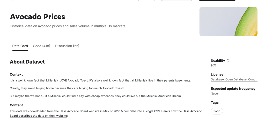
For this example, we will be using the Avocado Prices dataset from Kaggle. This dataset contains a CSV file containing the records of avocado pricing and sales across regions and years.
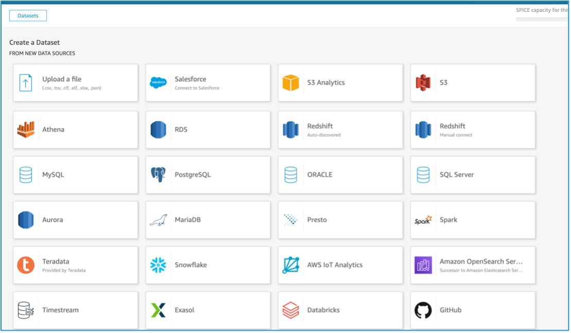
The first step is loading the data into a dataset on QuickSight. Start by heading over to QuickSight and clicking on “Datasets” on the left side of the screen, then “New dataset.” Select “Upload a file” and choose the CSV we downloaded earlier. If you have decided to use other data sources, select the appropriate options below.
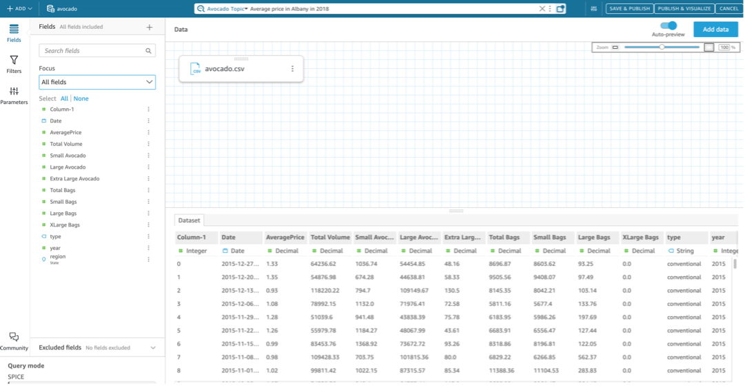
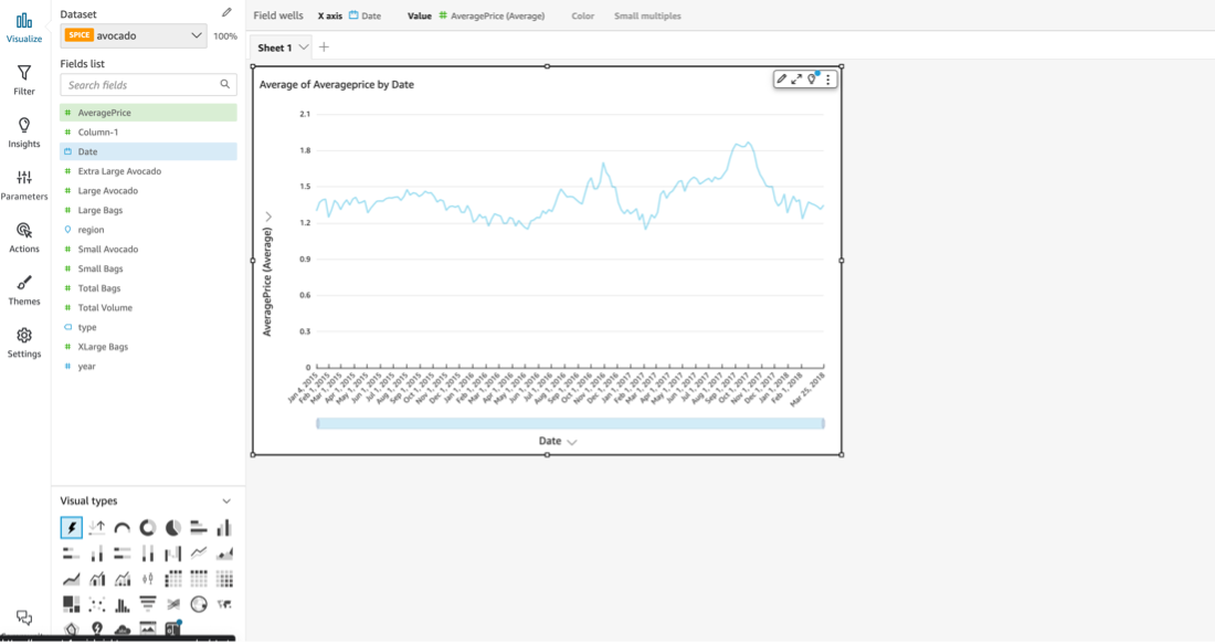
After uploading the CSV, select “Edit / Prepare Data.” This section details how to make edits to make the data easier to work with. For example, change the column names from the product “Price Lookup Code” to business-friendly terminology. After uploading out data, select the “Edit / Prepare Data” button to begin. On this screen we will see a small window with a sample of our dataset. Click on the top of the columns titled “4046”, “4225”, and “4770” and rename them “Small Avocado,” “Large Avocado,” and “Extra Large Avocado,” respectively. Then select “Publish and Visualize”. Here we can play around with the data for a few minutes to get a basic read of what we have. Try selecting different columns and QuickSight will automatically generate a graph for you.
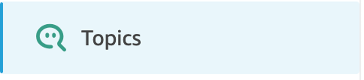
Navigate to the main screen of Quicksight and select “Topics”, which enables to create a new Q Topic. The Q Topic allows users to ask free-form questions about the dataset. Create a new topic and give it a meaningful name, in our case, “Avocado Example Topic.” Click next and look for the dataset in the drop-down menu. After selecting, Quicksight will first pass through the dataset to set up basic configurations.
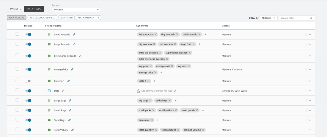
Now that the topic is set up you can configure it to get the most out of the data when asking questions. The first step is to go to the data tab to see all the column names and select which ones Q will use based on the business use case. The most important part of the process is filling in synonyms for the columns. This allows business users to word their questions using business-friendly terms which Q will still understand. QuickSight fills in an initial set of synonyms for different categories and allows users to edit the columns to add more synonyms. For example, one can add “Extra Large Bags” as a synonym for “XLarge Bags,” and “mini avocado” as a synonym for “small avocado.” You can also click on a section to learn how it will format the data, examples of that column, and what type of data it is.
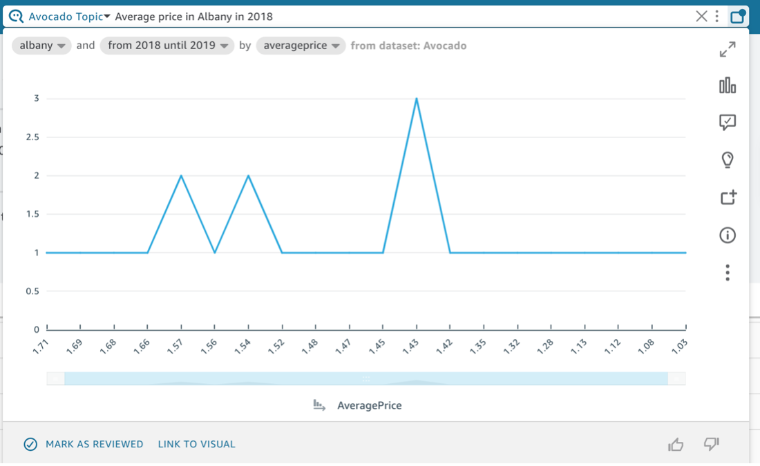
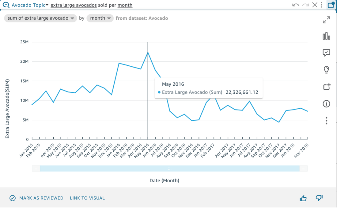
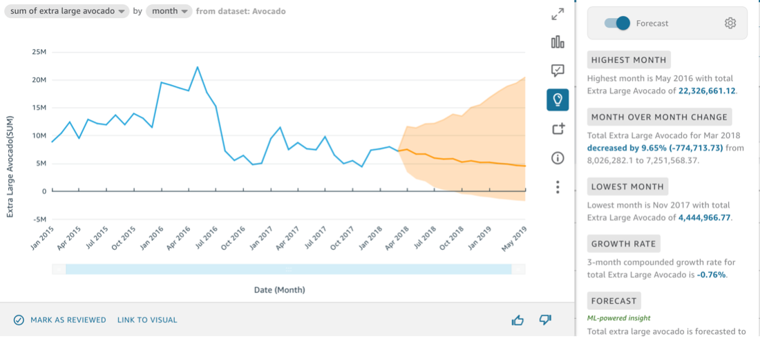
After the data is configured, QuickSight users can ask Q questions about the dataset. Ensure you select the right topic in the Q search bar and start asking questions. An example question for this dataset is to ask, “Extra Large Avocados sold per month.” Q will generate a graph showing the sum of “XLarge” avocados sold monthly. Here we can see the synonym set up earlier at work. You can click the little bar chart icon to customize the visualization further. You can also click on the lightbulb icon to gain insights about the selected data. A click on the “Forecast” button will use a Random-Cut Forrest machine learning model to predict what your data will look like in the future.
Now that topic is configured, we can use it on our dashboard. After setting up a dashboard with our dataset, we can ask Q questions and load the graphs created by it into our dashboard. Now that Q is all set up on the dataset, you can play around with asking queries and tweaking the charts being returned to create a visualization showing trends in the data. As we can see QuickSight and Q are potent tools to derive deep insights with users who don’t have SQL or AI/ML background.


